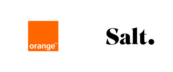
I have to admit that I have never been a huge fan of corporate rebranding. In theory a rebrand should go deeper than just the corporate logo and colours but should also include a change in direction and culture for a brand. Of course very often though the result is essentially a change in logo and colours and everything else stays the same. Some of the somewhat dubious reasons for a rebrand include:
- Change in management – essentially new management, pander to their egos and want to get rid of the brand that is associated with their predessors and bring in something new that is linked to them.
- Corporate “stumble” – some corporate disaster that leads to the desire to disassociate the company with its previous mistake or scandal
- Consultants advice – Consultants are brought in (possibly as a result of the above points) and advise that a total rebrand is a great idea
- Negative brand perception – Possibly due to point 2 or simply the result of poor marketing there is a perceived need to change the brand to be able to build a more positive image
- Market research – Hopefully a large market research study, which includes a number of types of research from broad surveys to social media listening to focus groups, identifies the need to change the brand. Sadly often the size of the market research study group is far too small or is based on a few focus groups which may not represent the bulk of users, thereby leading to misleading insights.
There are of course many other reasons for rebranding but I think the above captures some of the main ones. Whilst I may be a bit cynical this is because I rarely see rebrands that I actually think “Wow – this new branding speaks to me”, but rather I am often left thinking “erm … why?”. This is in fact one of the big issues with rebranding is that often consumers are left feeling perplexed and sometimes even angry that their beloved brand has been changed, especially if it is a strong, well established brand. There are plenty of examples of failures out there so it does surprise me to still see corporations doing dubious rebrands – and paying big bucks to do so too.
And so I come to a recent rebrand here in Switzerland. The striking, and well known Orange mobile phone brand changed the other week to a bland, dull and mundane Salt. I remember when Orange first launched asking why on earth a mobile phone company was named after a fruit but then I got the striking and strong colour element and the brand grew on me. Now it is a clearly established brand with a strong identity. Why change it? Well let’s go back up to our list and then pair that with the fact that Orange Switzerland was recently acquired by French billionaire entrepreneur Xavier Niel for 2.8 billion CHF- it becomes a bit clearer what could have driven the rebrand. There is also the fact that Orange Switzerland was having to pay 20,000CHF per year for the use of the name. This makes a bit more sense and I see some potentially sound reasoning for a rebrand, but …. why on earth choose Salt?!
Orange Switzerland has gone from a strong, vibrant, dyanamic and energetic brand to a dull, monotonous, everyday commodity brand. Gone is the colour and the energy and in comes the black and white and nondescript condiment. To top of this bizarre branding is the fact that it apparently cost $40 million CHF and a pretty shaky brand switch. As an Orange / Salt customer I had the joy of experiencing my network being down, the Orange / Salt shops shut for 3 full days while they rebranded the shops (3 days? Most of these stores are tiny!) and an overall poor customer experience. Even though I have now been bombarded with very dull rebranding adverts I am still at a loss as to what has happened and more importantly why. Gone is the old strong brand, in comes the dull weak brand. Other Orange / Salt customers I have spoken to here are equally flabbergasted, a few were also seriously inconvenienced with the network issues during the rebranding.
For me branding is really important and if you are going to rebrand at least make it strong, impactful and meaningful, and do not disrupt your customer’s experience during the process! As a paying customer I was so unhappy with this rebrand and the whole experience that I have now switched to Sunrise (that and they had more flexible contracts!). Perhaps if there had been some clear communication around why there was rebrand and what it actually stood for – including what corporate culture and ethos the new brand brings – I may have seen some sense in it all. As it stands all I see if $40million CHF of wasted money and the birth of seriously non-descript brand.


